just get the party started — tincan #002


You need a font, a color, and a logo to launch a brand (but don’t design your own logo, there’s an easier way).

Alyssa and I recently agreed to host a birthday party for our friend Hannah and 50 people ended up rsvp’ing. Woah. At first, it was an overwhelming number of people to plan for, but then I bought things and made things, and got really into it. But everything screeched to a halt when I realized we had one big problem: the flow.
Our house is very old with serious, distinct rooms that really suck you in and make you forget about the rest of the house. It’s the polar opposite of open-plan. I tried to counteract this (first, by asking Alyssa if I could cut a new doorway into the dining room; she declined) by making sure that each room was super useable so that the party could morph into any of the spaces. We put a table of drinks outside with a fire pit area, extra seats and room to sprawl in the living room, and — my favorite — a disco dining room where we’d pushed the furniture to the edges of the room and added disco lights. Looking around before the party, I thought we’d nailed it. Every single space seemed ready to welcome a crowd. But from the moment the party started all the way to its final fading moments, the party didn’t leave the kitchen.

My knee-jerk reaction was annoyance (how could no one want to be in the disco room?!). But I get it, kitchens are home-y. There was food and access to drinks via the back door. The island made it possible for a group to gather and chat. Everyone else was standing and mobile, bouncing from one conversation to another. Kitchens have a warm, approachable atmosphere that makes you feel at home in someone else’s house.
It’s not possible to design a perfect party or dictate how people use the house. It’s the people who show up that make the party into a good party.
When getting a new brand off the ground, there’s a similar balance to strike: you’ve got to get the party started but you can’t try to button everything up all at once. Admittedly, there’s an argument for buttoning — people want to be impressed and they also need to trust you, and good design will help establish that — but the building of a brand doesn’t happen instantaneously. It’s not realistic to expect yourself to churn out a perfect brand right from the start.
There are only two things needed to get the brand (party) started : 1) a brand identity, aka the look and feel, and 2) a website to house the information about the brand. The website can feel like the easy part (thanks to an abundance of user-friendly website builders), but it’s the brand identity that’s particularly intimidating, especially if you’re a person who identifies as “not creative.”
A brand identity can be as simple as a font, a color, and a logo.

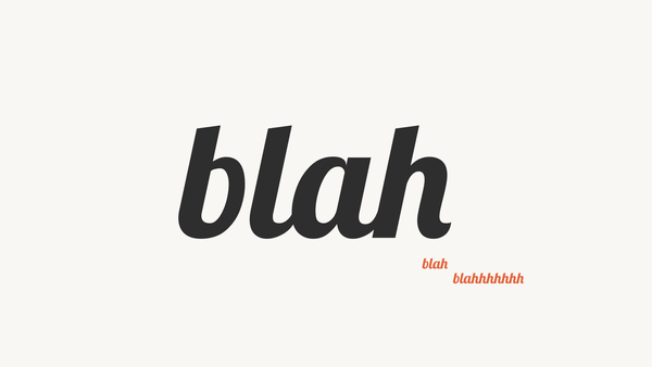
get a font
I like to use Google Fonts because they're free and the fonts integrate seamlessly with Google’s tools. You’ll want to look for a font with multiple styles (light, regular, bold, black). Here’s an explainer article from Adobe about when to use a serif or a sans serif. Feel free to break the rules.

get a color
I’m not someone who has ever been able to grasp color theory but Coolors is a great resource for the color-worried. You can view trending color palettes or open up a specific color in the color picker to manipulate its shades/tints and learn how to use it with other colors.

get a logo
Definitely don’t try to design your own logo. Logo design requires skill and expertise and, unless you’re embracing a pared-down aesthetic (like this bar in Philly, Martha), it’s better left to the professionals. I try to stay very far away from logos.
You can instead create your own logotype, which is a logo that uses only the brand’s name. SweetGreen, Baggu, Madewell, or even The New York Times use a logotype. They’re simple and effective.
So go back to Google Fonts and choose a font that you’ll use to type out the name of your brand. You can reuse the font that you chose earlier or you can pick a new one. Whatever the case, the logotype font should embody your brand’s personality (disruptive or supportive; industrial or natural; cutting-edge or classic; playful or serious; etc). One font can say a lot. You’ll have to determine which font says the right things.
After you’ve put all of the brand identity components into your website builder, don’t waste any time in opening up the doors. The point isn’t to make everything look, feel, and sound perfect — the point is simply to welcome your guests. Relish in the fact that this version of your brand is the simplest version that it will ever be. Everything after this moment will just get more and more complicated.

The next time Hannah turns 30 I’ll be the first person to happily post up at the kitchen counter, and let go of my preconceptions about how something is supposed to be. When the vibes inevitably start to feel just right, the disco room will beckon, and we’ll all get to dance freely and cheer on Hannah as she does a flawless bridge on the dining room floor.
about anne marie
Anne Marie is a designer and diy-er who lives in Philadelphia with her partner, Alyssa, and two cats and a dog. You can find her on Instagram and LinkedIn and at amlindemann.com. Reach her directly at: annemarie [at] amlindemann [dot] com.