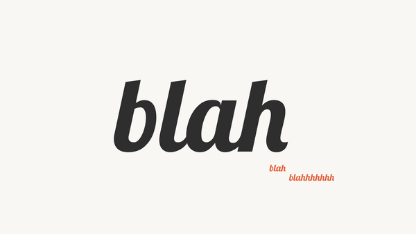
brand identity guidelines: why they’re so important and how to do it yourself — tincan #006


I love it when a cookbook opens automatically to a certain beloved recipe and it’s smudged up with various flecks of ingredients and has notes scrawled in the margins. I also really love opening up the family recipe card box and thumbing through the hand-written, memory-filled index cards. And when I pop open an online recipe from NYT Cooking, I love reading through the comments section before I even start reading the recipe itself. All of this is because a really, really great recipe is one that’s messed with and passed around.
In this issue, we’ll go through the reasons why it’s important to write a “recipe” for your brand and how to do it in a way that sparks good ideas and actually works for the cooks in the kitchen.

Sooo first we’ll pop open a can of You Can Do It Gardening’s Instagram, and then we’ll wolf down a main course of brand identity guidelines, and then we’ll follow it all up with a few sweet treats of inspiration, links, and recs.
Dig in!
aml

You Can Do It Gardening
...and you can do it MARKETING

Take a quick glance at Jess Zander’s Instagram (@Youcandoitgardening) and you might immediately feel overwhelmed by the sheer number of similar-looking videos, but click in and watch just a few of them and she’ll pull you right in with warmth, humor, and practical gardening advice. She appeared in my feed two months ago and I’ve been riveted since.
When you watch her videos it almost feels like she’s right there with you…partly because she kind of is. She may technically be talking directly to her Boston-area clients in each video, but they’re filming and watching her through their phones just like you, so you are her client and her client is you and her content is meant for both of you.

From a visual storytelling perspective, the way that she shows up on the app is identical to her approach to gardening: down-to-earth, no-nonsense, and universally doable. None of her branded elements are overly designed or fussed over. She uses a very light touch with her video editing and on-screen graphics. I’m not even sure that she records multiple takes of her videos either, it seems like she’s truly recording them on the fly. Her content feels very approachable, authentic, and easy to digest as a result.
She’s got a whopping 360k followers (!) which puts her up there with the likes of more commercial brands and influencers, but her brand doesn’t ooze money or resources — it’s decidedly pared down. And if you take the time to unpack everything in full, you’ll find that she’s still checking all of the same boxes as the big-time players, she’s just applying it to her brand in a way that suits her and that works for her target audience. She’s a wonderful reminder that you don’t need to cosplay a fancy superbrand to be successful, you just need to find what works for you and the people you’re talking to.

let's get into it:
brand identity guidelines
what they are + how to write your own

A brand’s identity is how it shows up in the world: how it looks/feels/sounds, what it says, what it stands for, and how it interacts with others. If you were to hire a graphic design professional or work with an agency to do your branding, one of the final deliverables that you’d walk away with would be a pdf called the “brand identity guidelines” which is just the recipe for the brand, complete with all the ingredients and instructions you’ll need to put the new brand identity to use.
The bigger the brand, the more important it is to have guidelines like this to pass around to new employees or contractors so that they can quickly get up to speed and create branded materials. Small brands benefit from guideline-writing too though, just a little less intensely. A simple set of guidelines is all that’s required to create a sense of consistency for your brand — and consistency is the #1 goal. The more visually, verbally, and palpably consistent your brand is, the stronger the brand becomes in the minds of the people who encounter it.
But being consistent is complicated. There are certain elements of a brand that require a regimented, almost mathematically-consistent approach, like how a logo should be used or what exact shade of black it should be (and those sorts of details should be very clearly defined with specific instructions to make exact replication possible), but other things, like how the brand speaks or what type of language it uses or how it expresses itself through imagery, require a more loosey-goosey level of instruction. It’s why brand guidelines are guidelines, not commandments. They need to be specific enough to get everyone on the same page, but general enough to be applied to many different modes of communication.
“Consistency is often wrongly associated with sameness, but it can mean consistently distinctive and vibrant. That can be achieved simply by using a single typeface in a variety of ways, combining a distinctive palette with compelling copy, crafting a more extensive use of complementary elements, and myriad other ways that help to visually ingrain a brand experience to memory.”
—David Airey, Identity Designed: The Definitive Guide to Visual Branding
When a brand really nails it, you’ll immediately start to notice the visual cohesion. Maybe you’ll see an item out in the world and it will remind you of the brand because it looks like them. You’ll also start to feel like you really “get” the brand. You might laugh at their jokes or feel a stronger sense of connection. Brands who are really well-defined and full-realized are more likely to be deeply loved by their audiences.

write your own guidelines
You’ll need to actually look through a real brand identity guidebook to fully understand what goes into one but it’s also really hard to find them online because brands usually keep them for internal use only. That shouldn’t deter you from asking people to share them privately with you though.
Here’s one that’s publicly accessible: RISD’s brand identity guidelines.
If you’re writing your own brand guidelines, you don’t need to walk away with a slick pdf version of a brand guidebook. It’s mostly the act of writing the out (even if they’re just a few bullet points) that’s important. By giving yourself a few parameters for what your brand should look like, feel like, and sound like, it becomes much easier to then move the brand forward in a distinct and consistent way.
Here’s what to include:
logo usage
Prep your logo files and save them in a designated place so that you always use the exact same logo. You might want to make multiple versions of your logo too — maybe a different color version or a very small version for things like social media profile pictures or email avatars.
Make a note of how you’d like to refer to your brand in writing. Are abbreviations allowed? Is there a “the” in the name? Is it capitalized?

Bok has a simple logo and they use it very consistently, but over time they’ve also allowed it to morph and grow.
font and color usage
Fonts: write down all of the fonts and weights (light, regular, bold, etc) that should be used for headings, subheadings, and paragraph text. Colors: give each of your brand colors a name so that they’re easy to refer to in conversation. Write down their Hex numbers so that you can come back and copy/paste it when you need it.

Downtime bakery’s visual identity is super succinct and consistent. Identities don’t have to be complicated and have tons of rules to be effective.
tone
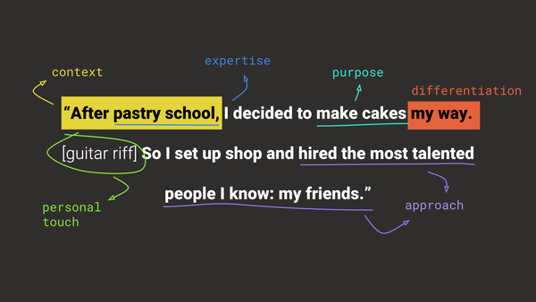
Maybe the hardest part. I really love how RISD breaks it down in their “how we sound” section. They’ve defined their tone in just three words — curious, empowering, proactive — and it all stems from their core messaging: RISD “questions to create and creates to question.” So when you’re settling on your brand’s tone, the best place to start is with your core messaging (here's how to do the messaging). Revisit it and write down some keywords and then use those words to inform the guidelines for your tone.
Additional considerations
- What’s your brand’s personality? Is it inspiring, confrontational, aspirational, assertive, spunky, intelligent, curious, supportive, high-brow, down-to-earth?
- What feelings does your brand evoke?
- What is it committed to?
- How is all of this reflected in the language that it uses? What are its mannerisms, attitude, or way of speaking?
The National Park Service’s Instagram captions are unflappably happy, funny, informative, thought-provoking, and awe-inspiring — all of which are right in line with the three big keywords from their mission statement: enjoyment, education, and inspiration.
visuals
This is a loose category that contains a wide range of media: photos, illustrations, video, iconography/symbols, social media posts and clips, graphics, etc — it’s anything that you use to express your brand visually. You’ll want to have your brand’s tone fully defined before you start on this one because the visuals will go hand in hand with it. Is your brand’s tone inspirational? Then maybe you’ll want to use a photojournalistic approach. Authentic? Phone-captured images and video will do. If it’s got a silly side then maybe you can throw in a meme or two.
Additional considerations
- What do the visuals need to do for your brand? Showcase your space or your product? Humanize your brand? Explain things in a visual way?
- What’s the style? Is it photojournalistic? Authentic? Nostalgic? Polished? Still-life? Action? Meme-y? Manipulated? Retro? Handmade?
- What’s the subject matter of the visuals? Should it only ever show people in action? Does it only ever show your product?

Loco pez’s use of imagery on Instagram sparks conversation and makes you laugh. They also use multiple styles, a mix of their own photography and internet memes, which keeps things feeling variable and interesting.
layouts
The final element in the brand identity guidelines should show how all of these elements come together in a piece of content. We’ll call that “layouts” and we’ll get into that in a future issue.

- For an example of the brand-building process: Smith & Diction is a Philly design agency who wrote a Medium post about how they go about designing a new brand identity. It’s super helpful to see how the pros tackle it.
- …But if you’re a diy-er: you can get your brand up and running with just a font, color, and logo.
- The Subtext is the destination for brand writing. Really helpful to see how professional copywriters and content strategists operate.
- At Blush.design you can pick illustrations and even modify them to work for your brand.
- Shop around for photos and icons at The Noun Project.


I’m Anne Marie, a designer and diy-er who lives in Philadelphia. I primarily work with large and small brands on their marketing/design but I also do video/motion graphics. You can see the work that I’m hired to create on my website. Connect with me on LinkedIn and reach me directly at: annemarie [at] amlindemann [dot] com — I'd love to hear from you!